

Maccaferra is a distinguished brand specializing in architectural projects, dedicated to crafting spaces that inspire and endure. With a rich legacy of innovation and excellence, Maccaferra seamlessly blends creativity with functionality to deliver iconic designs that leave a lasting impression.
Identity Problem and Solution
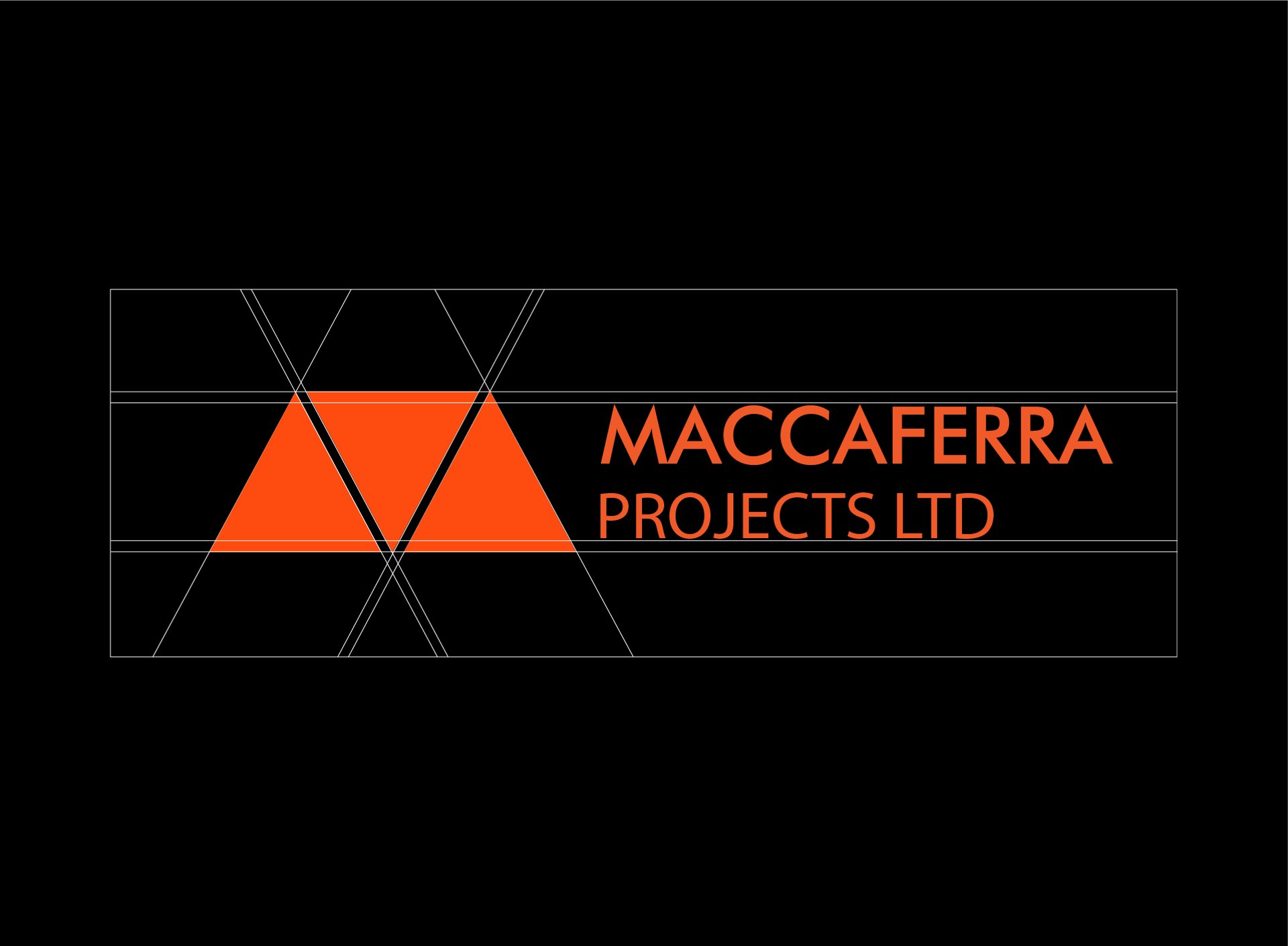
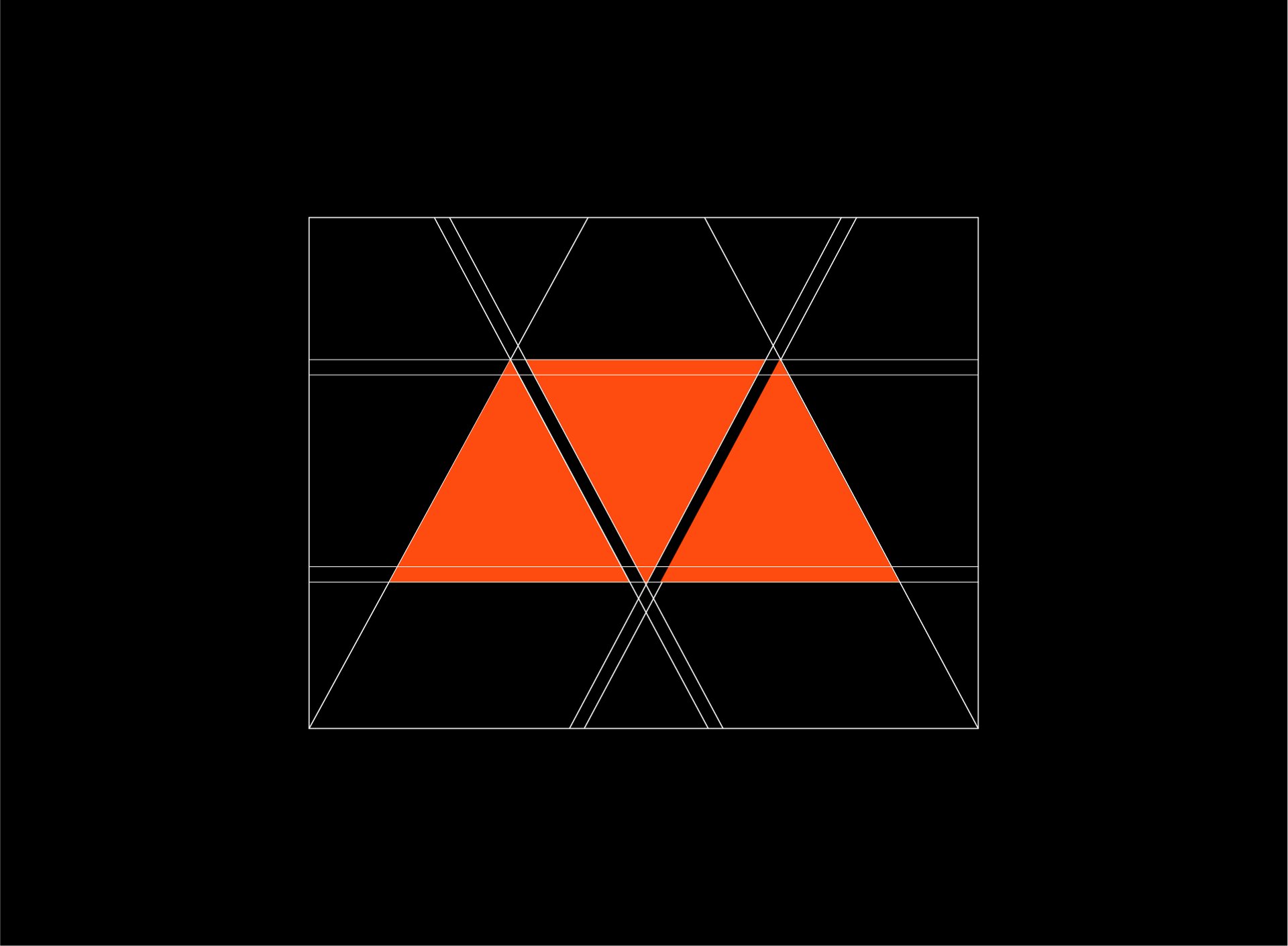
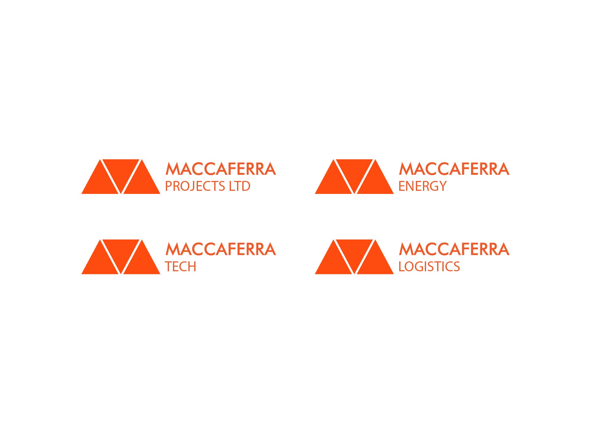
Three triangles fill up the negative space of the letter “M” to form an abstract mark alongside the name. The three triangles also represent the three core brand values of the Maccaferra brand: CREATIVITY, INTEGRITY AND PROFESSIONALISM. The combination of the abstract mark and the Brand Name also gives room for sub-brands to be consistent with the current logo in the future. One advantage of this option is that the abstract letter M can sit on it’s own without the brand name when the logo is needed in small scale.
About Maccaferra Projects

The brand mark is simple enough to be easily recognized without the brand name sitting by it’s side. This is very important in small scale applications where using the full logo isnt feasible.
The Maccaferra brand operates a Branded house style of Brand Architectre, the Logo was made with this in mind to accomodate future Maccaferra brands into the Logo .
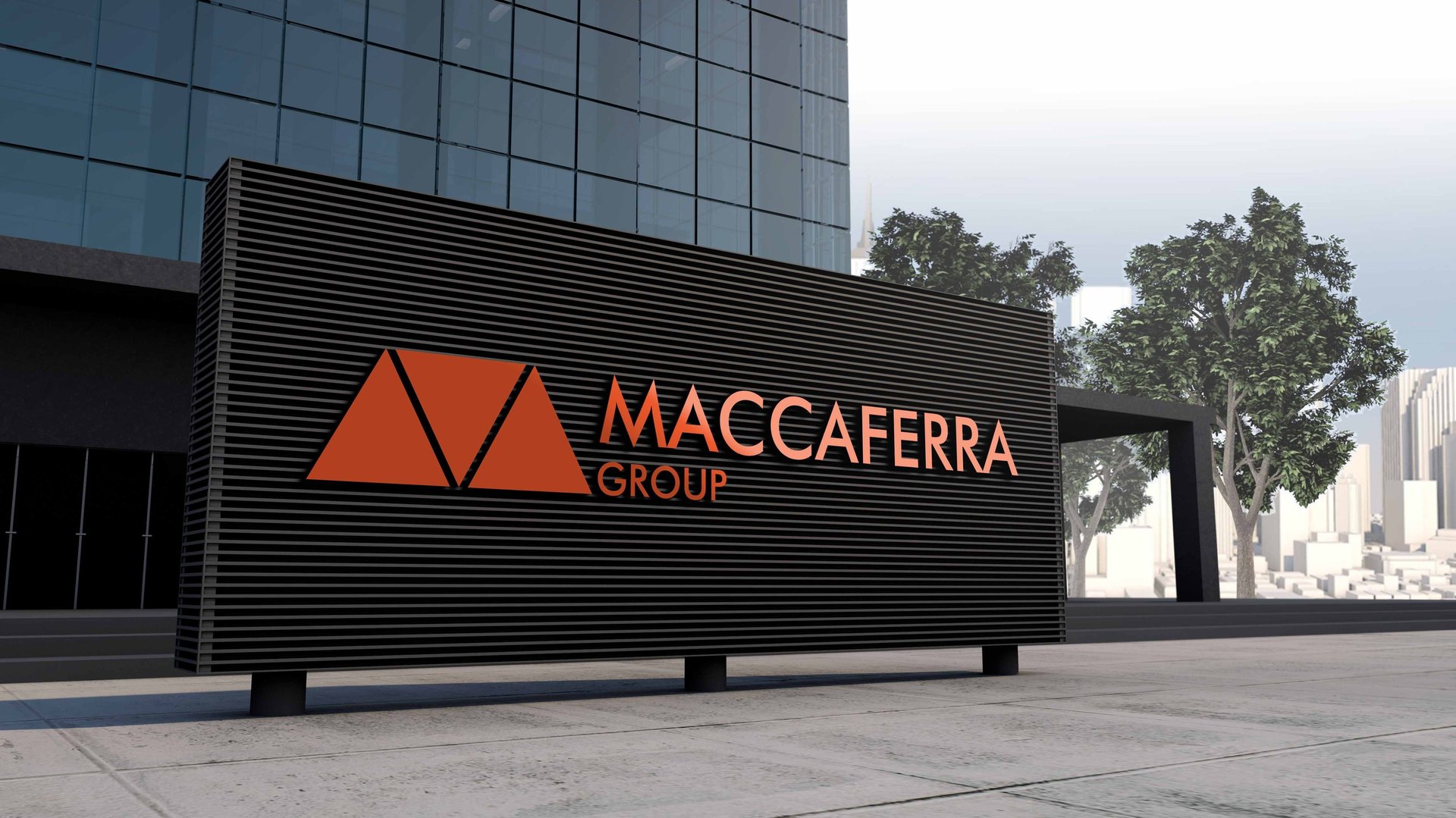
Maccaferra's brand colors of orange, black, and white reflect its values of creativity, professionalism, and integrity. Orange signifies innovation and passion, black represents sophistication and excellence, while white embodies transparency and honesty. Together, these colors create a cohesive and visually striking brand identity that communicates Maccaferra's commitment to delivering exceptional architectural solutions with integrity and creativity.