PEG is a global cargo logistics company; where they move more than cargo, PEG move possibilities. The brand specializes in delivering goods safely, efficiently, and on time, across borders and across industries. With reliability at their core and innovation driving the brand forward, PEG is committed to connecting businesses worldwide with seamless cargo solutions.
Identity Problem and Solution
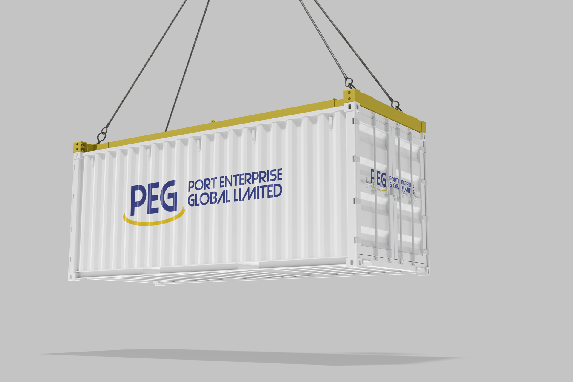
When we began shaping PEG’s brand identity, the challenge was clear: the company needed a mark that was both professional and instantly recognizable, while also communicating its international scope. To solve this, we designed a logo built around the initials “PEG”, bold, simple letterforms that establish strength and reliability. Beneath the name, we introduced a round swirl element, symbolizing movement, connection, and global reach. This visual cue reinforces PEG’s role in linking businesses across continents, while the clean typography ensures the brand remains timeless and versatile. The result is a logo that not only identifies PEG but also embodies its promise: a global cargo partner moving forward with confidence.
About Port Enterprise Global Limited (PEG)
We didn't just stop at creating a logo, we went further and created a distinct brand pattern by extending the swirl from the PEG logo, turning it into a dynamic graphic element that reinforces the brand’s sense of global movement and continuity, the brand pattern supports the logo in building visual equity.